3D Tilt Effect And Text Outline Effect With CSS
What are we going to rebuild?
In this Blog Post from my UI / UX Bits series, we will rebuild a nice navigation interaction built by Eric Van Holtz.
You can find it at https://vanholtz.co/
We going to rebuild this UI interaction.
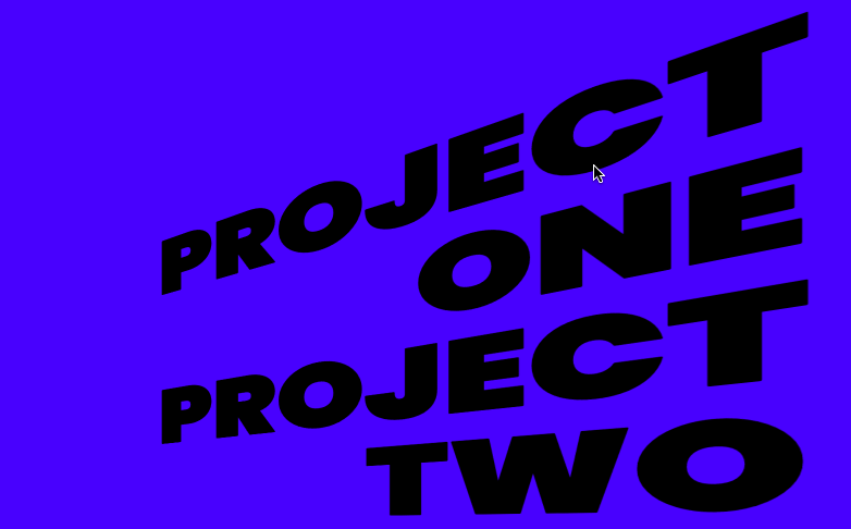
What do we see?
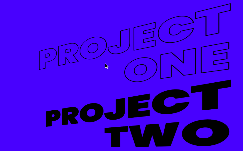
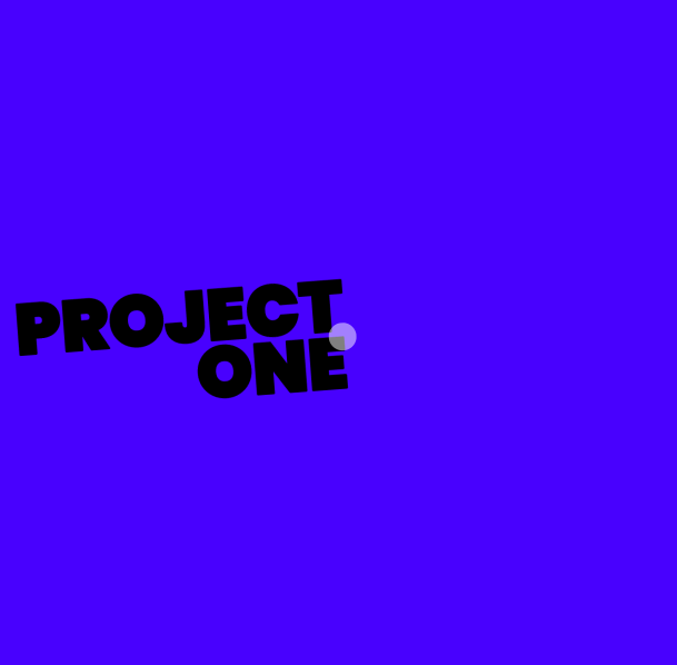
We see a list that navigates us to the different projects of Van Holtz. The navigation items look like they're tilted in the 3D space. If we hover over an item, it will tilt forward, and the text will get outlined.
If you want to go straight to the code, you can play with it here.

How can we recreate it?
The 3D Tilt Effect
First, we build the HTML structure, a simple list with some items.
<!DOCTYPE html>
<html lang="en">
  <head>
    <link rel="preconnect" href="https://fonts.googleapis.com" />
    <link rel="preconnect" href="https://fonts.gstatic.com" crossorigin />
    <link
      href="https://fonts.googleapis.com/css2?family=Poppins:wght@900&display=swap"
      rel="stylesheet"
    />
    <meta charset="UTF-8" />
    <meta http-equiv="X-UA-Compatible" content="IE=edge" />
    <meta name="viewport" content="width=device-width, initial-scale=1.0" />
    <link rel="stylesheet" href="./style.css" />
    <title>UI/UX Bits - vanholtz.co</title>
  </head>
  <body>
    <main>
      <ul class="project-list">
        <li class="project">
          <a href="">Project<br />One</a>
        </li>
        <li class="project">
          <a href="">Project<br />Two</a>
        </li>
        <li class="project">
          <a href="">Project<br />Three</a>
        </li>
        <li class="project">
          <a href="">Project<br />Four</a>
        </li>
      </ul>
    </main>
  </body>
</html>
Our main tag has a list with the class "project-list," which contains the different projects. Each project has the class "project" and a link.
The HTML part is done with this simple list.
We start with some variables in our CSS to make the code more organized.
:root {
  --background: rgba(72, 1, 255, 1);
  --black: rgba(0, 0, 0, 1);
  --font-size: 7vw
}
The font size is set in VW to make the 3D effect look the same on different viewport sizes.
We just set the font family and the background color in our body.
body {
  background-color: var(--background);
  font-family: "Poppins", sans-serif;
}
Now we can start styling our list.
.project-list {
  padding: 2rem;
  text-align: right;
  list-style: none;
  -webkit-perspective: 500px;
  perspective: 500px;
}
The padding is to give the list a little bit more space. To make it float on the right side, we must align the text to the right. We remove the list styles to only show the text of the list items.
Perspective is the first property we need for the 3D effect.
The Perspective property allows 3D space for child elements. Perspective sets the amount of space the element gets in the 3D space.
When defining the perspective property for an element, all child elements get the perspective view, not the element itself. In our case, we set it on our "project-list" class to give the "projects" a 3D perspective.
The Perspective property affects only 3D transformed elements.
Now we can start with our 3D effect
.project {
  transform: rotateY(-45deg);
  transform-origin: right center;
  transition: transform 0.3s ease-out;
}
The transform-origin property lets us define the center of rotation of an element To make our list item look tilted into the z-axis, we must specify the point of rotation to the right and the center of the element.
The default value for transform-origin is:
transform-origin: 50% 50% 0;
Which is equal to:
transform-origin: center;
If we rotate our project item with the default transform-origin, it will look like this.
If we change our transform-origin to:
transform-origin: right center;
It looks like this:
To get the 3D effect, we simply rotate the element on the y-axis.
transform: rotateY(-45deg);
The transition property animates the state change in the CSS. We only want to animate our change in the transform property with an eas-out. Instead of eas-out, you can use the cubic-bezier function to make the animation look smoother and more natural.
You can play with the cubic-bezier function here.
Now we need to style our anchor tag.
.project > a {
  color: var(--black);
  font-size: var(--font-size);
  line-height: 1;
  font-weight: 900;
  -webkit-text-stroke: 2px;
  text-decoration: none;
  text-transform: uppercase;
  transition: -webkit-text-fill-color 0.3s ease-out;
}
The styling for our anchor tag is mostly just visual. The transition property is for the outline effect animation, which we will build after the 3D tilt effect.
Now we need to add the effect on the hover state. To do that, we need to add a rotationY on hover to our project item.
.project:hover {
  transform: rotateY(-25deg);
}
Because we set the transition property on our project item to transform, the project item will animate on hover. We rotate the element from -45 to -25 degrees to make it look like it comes forward.
It should look like this now.
The Text Outline Effect
If we look at the styling of our anchor element, we can see that we used these two properties.
 -webkit-text-stroke: 2px;
  transition: -webkit-text-fill-color 0.3s ease-out;
The transition is set to animate all changes in the -webkit-text-fill-color property in 0.3 seconds with an eas-out curve.
The text-stroke property sets a border for the text of our anchor element.
To animate it on hover, we need to add the hover style as we did for our 3D tilt effect.
.project:hover > a {
  -webkit-text-fill-color: transparent;
}
For our hover animation, we set the text-fill color to transparent. Since we added a border to our text, the text won't be invisible, and we can see the border.
With the element>element selector, we ensure that the hover style changes are applied for all anchor elements where the parent element has the class project.
Now it should look like this.